Updated 3:21 p.m. with additional city data.
As our Julie Bierach reported yesterday, the flu this year is early, strong - and a second wave is expected.
But where? To use a phrase which may resonate with some of you - "let's go to the map!"
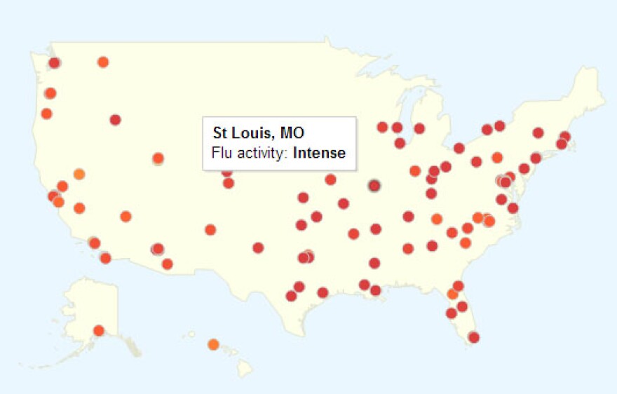
The folks at Google have devoted a portion of their efforts to something called "Google Flu Trends" which uses search data to "estimate current flu activity around the world in near real-time."
Is this perfectly scientific? Well, no. But it's certainly interesting.
As of the writing of this post, here's what the St. Louis area looks like on the Flu Trends site:
Intense, it seems.
Another site, FluNearYou.org, goes a bit further, allowing people to participate in reporting of data, along with presenting findings from the Centers for Disease Control and Prevention and Google Flu Trends. Here's how the St. Louis area looked on their map using data through Jan. 6 (to interact with it on their site - click here):

But how does this compare to previous years? And what do the trends look like over time?
As far as search trends go, here's a screen capture from the chart portion of Google Flu Trends which compares the trends of flu-related searches in St. Louis last season to this season. As you can see, there's been quite a spike already this season:

(You can also click on the chart below to explore more on Google.org - the company's arm for "technology for social impact"):
For a little bit more data fun, the City of St. Louis also released this chart, plotting the percentage of reported ER visits per week for flu-like illness since 2009. How many cases of flu were reported in the city since Oct. 1, 2012? 887.

Follow Kelsey Proud on Twitter: @KelseyProud


